Digital experiences built for performance + scale
Back to Blog

Playbook

Website accessibility QA checklist before a redesign launch

Accessibility QA should happen before launch week, not after complaints arrive. Use this checklist to test contrast, keyboard navigation, forms, content structure, media, responsive states, and the handoff process.

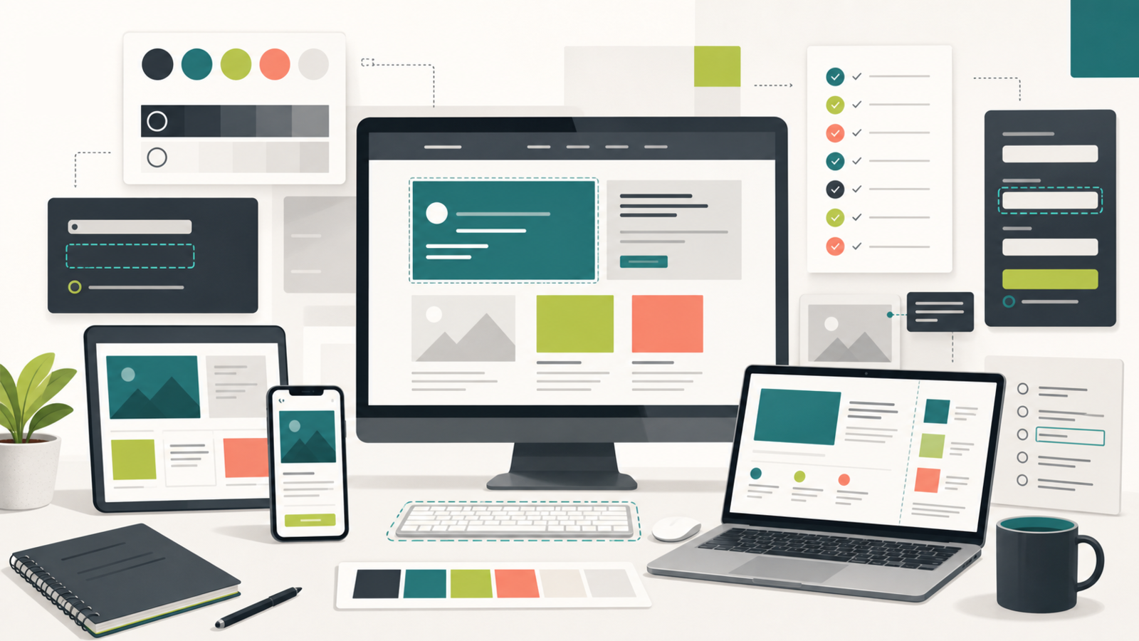
Accessibility QA workspace with website panels, contrast swatches, form checks, and responsive devices

Practical tool

Accessibility QA

Published

May 24, 2026

Read time

9 min read

Topic

Technical SEO / Redesign / B2B / Operations / Playbook

01

Run accessibility QA before the launch freeze

Accessibility QA is easiest to fix before the redesign is frozen. Once content is approved, redirects are mapped, and developers are focused on launch defects, every accessibility issue competes with deadline pressure. That is when basic problems slip through: low contrast buttons, missing focus states, vague links, unlabeled form errors, and image alt text that nobody owns.

This checklist is for B2B sites, service websites, Shopify storefronts, and WordPress builds where the website has to generate trust after launch. It is not a full WCAG audit, but it gives the team a practical QA pass that protects users, improves content quality, and catches technical SEO issues that often hide inside accessibility debt.

02

Step 1: Test contrast on real page states

Do not test color contrast only inside the design file. Test the built pages in light mode, dark mode if the site has one, hover states, disabled states, sticky navigation, cookie notices, cards, badges, and form errors. Many contrast failures appear in secondary UI, not the hero section.

For a redesign, pay special attention to brand colors. A new palette may look refined in a presentation but fail on small text, muted labels, outlined buttons, or image overlays. If the team wants to keep a brand color that is weak for text, reserve it for backgrounds, accents, or larger graphic areas instead of critical copy.

  • Check body copy, captions, metadata, labels, navigation, CTAs, and footer links.
  • Test text over images and gradients with real CMS content, not placeholder copy.
  • Capture any failing color pair with the page URL, component name, and replacement recommendation.

03

Step 2: Walk the site with only a keyboard

A keyboard-only pass reveals whether the site can actually be used without a mouse. Start at the top of each key template and tab through navigation, dropdowns, buttons, cards, filters, forms, modals, embedded calendars, cookie notices, and footer links. The focus order should match the visual order, and the current focus should always be visible.

This is especially important for B2B websites because important conversion paths often sit behind menus, long service pages, resource filters, or contact forms. A beautiful page still fails if a buyer cannot reach the form, close a modal, or understand where the keyboard focus has moved.

  • Confirm every interactive element can be reached, activated, and exited by keyboard.
  • Check that focus is not trapped behind menus, overlays, sliders, or embedded widgets.
  • Test skip links and make sure they land near the main content, not on another decorative block.

04

Step 3: Audit headings, landmarks, and link purpose

Heading structure is accessibility work and technical SEO work at the same time. Each page should have one clear H1, logical section headings, and no heading jumps created only for visual styling. Screen readers, search crawlers, and human reviewers all benefit when the content hierarchy matches the page intent.

Links need the same discipline. Repeated labels like “learn more” and “click here” are weak because they do not explain destination or intent out of context. On service pages and case studies, link labels should tell users what they will get next: a pricing page, a project example, a Shopify audit, a redesign checklist, or a contact path.

  • Review one H1 per page and a logical H2/H3 outline for every major template.
  • Check header, main, footer, nav, and form landmarks where the framework supports them.
  • Rewrite vague repeated links so the destination is clear without surrounding copy.

05

Step 4: Test forms like a distracted buyer

Forms are where accessibility issues turn into lost leads. Test every form with required fields empty, invalid email formats, long names, company names with punctuation, phone numbers from multiple countries, checkbox errors, spam states, and successful submissions. The error message should be connected to the field, easy to find, and specific enough to fix the issue.

Also test the non-visual path. Labels should be real labels, not only placeholders. Required fields should be announced clearly. The submit button should not become a mystery after loading. Confirmation pages or messages should explain what happened and what the user should expect next.

  • Check contact, newsletter, lead magnet, consultation, checkout, account, and search forms.
  • Validate error states, success states, loading states, duplicate submissions, and spam protection.
  • Confirm analytics events still fire after validation errors and successful submissions.

06

Step 5: Review media, alt text, and document downloads

Image alt text should describe the purpose of the image in context. A founder portrait, product screenshot, case study chart, Shopify product image, and decorative background should not all receive the same treatment. Some images need descriptive alt text, some need empty alt text, and some need adjacent body copy that explains the insight better than the image itself.

Downloads and embeds need review too. PDFs, videos, iframes, maps, booking widgets, and product media can introduce accessibility gaps late in production. If an embed is essential to conversion, test it like a core page component instead of assuming the vendor handled everything.

  • Write alt text for meaningful images and leave decorative images empty where appropriate.
  • Check captions, transcripts, controls, and fallback copy for video or audio content.
  • Avoid launching critical information only inside inaccessible PDFs or screenshots.

07

Step 6: Recheck responsive states and CMS edits

Accessibility QA can pass on desktop and fail on mobile. Recheck navigation, sticky buttons, accordions, filters, form fields, cookie notices, and tables at realistic mobile widths. Watch for content that becomes hidden, focus rings that move off screen, tap targets that collapse, or headings that wrap into confusing fragments.

Then test the CMS model. Ask someone to edit a service page, publish a blog post, change a CTA, upload an image, and add a testimonial. If the CMS lets editors create unreadable contrast, missing alt text, broken heading order, or oversized buttons, the launch is only temporarily accessible.

  • Test mobile, tablet, laptop, and wide desktop widths on the most important templates.
  • Check CMS fields for helper text, required alt text, character limits, and sensible defaults.
  • Document component rules so future campaign pages do not reintroduce the same issues.

08

What to hand off after QA

The useful deliverable is not a vague pass or fail. Send a short issue log with severity, affected URL, component, screenshot or recording, expected behavior, owner, and retest status. Separate launch blockers from post-launch improvements so the team can make decisions without losing the whole checklist.

Accessibility should also become part of maintenance. After launch, add a quarterly check for new templates, forms, media uploads, content-heavy pages, and analytics changes. A redesign can start accessible, but the site only stays that way if the CMS workflow and maintenance plan protect the decisions made during QA.

  • Launch blocker: prevents navigation, conversion, reading, or form completion.
  • High priority: affects important pages or repeated components but has a clear workaround.
  • Maintenance item: should be fixed soon and added to CMS or component governance.

Launch QA checklist

  • 01Test real page states, not only polished design files or the homepage.
  • 02Use a keyboard-only pass to catch broken menus, modals, forms, and skip links.
  • 03Check headings, landmarks, link labels, and alt text because they affect accessibility and technical SEO quality.
  • 04Test error, empty, loading, and success states before the launch freeze.
  • 05Leave a handoff log so future CMS edits do not undo the accessibility work.

Keep reading

Now booking for Q2 2026

Start a project

Tell us your goal, timeline, and budget. We'll reply within 2 business days with the best next step.

I'm Max, founder of Build Build Studio. I work with a small network of trusted designers, developers, and specialists, keeping senior attention and direct communication close to every project.
Mo – Fr: 9AM–5PMGMT+8 local time

Project communication

Mandarin / ChineseNativeCantoneseNativeEnglishWorking proficiency

Formal proposals and pitch work are scoped as paid discovery.

Start a project